POSTCARDS FROM THE MOON BRAND IDENTITY
Postcards From The Moon
OVERVIEW
There is a common misconception that Geography is a ‘boring’ subject.
But in reality, Geography impacts all of us, on a day to day basis - from the changing climate and its consequences on our environment, to population growth and economic shifts, down to the earth literally moving and changing underneath our feet. Postcards From The Moon is changing this misconception, by providing students and teachers with a highly innovative, visual and re-branded take on Geography, through the means of a bold and contemporary online learning resource.
BRANDING SCOPE
All branding and design by Ima Creative.
Branding Identity
Brand Strategy
Illustration
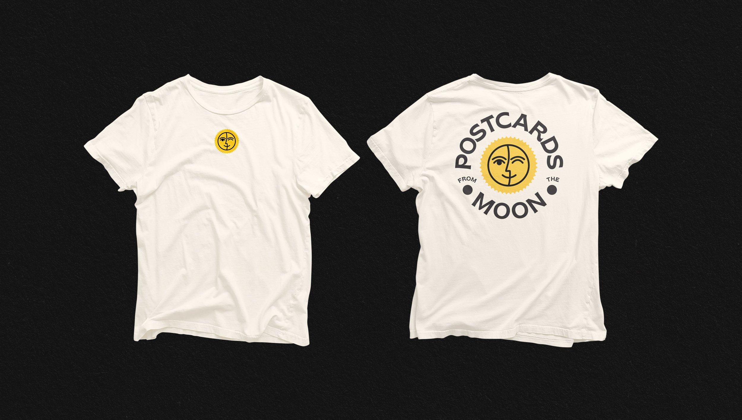
Print Collateral
-
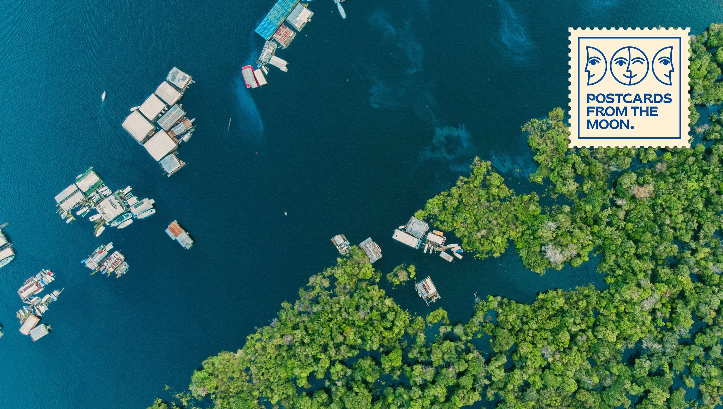
The environmental movement in the 1970s was started by the ‘Earth rise’ photo. This was the first time that humans had ever seen the earth from space and the image evoked a substantial shift in consciousness. Astronauts report a feeling of connectedness and fragility when seeing the earth from space. This has been termed ‘the overview effect’. The idea is that the moon has been looking down at earth and seeing the ways that humans are interacting with the natural environment. It’s a fresh way of interpreting what geography is for school students.
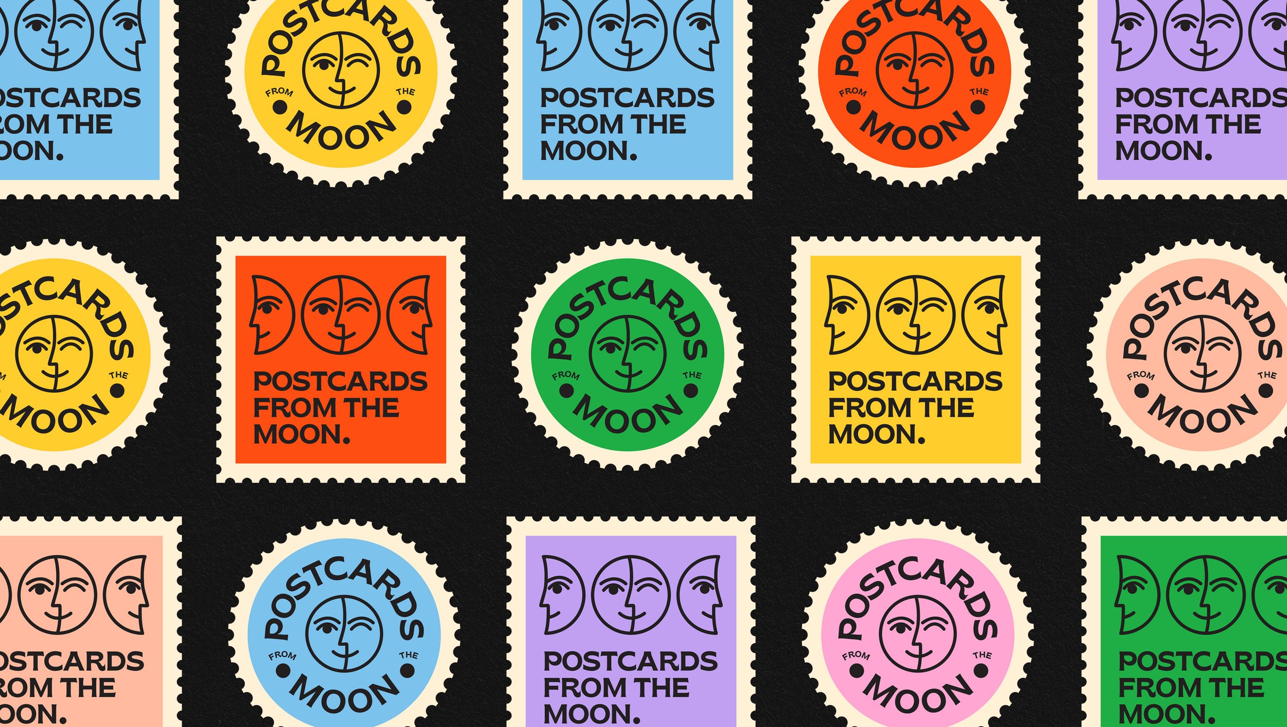
Postcards From The Moon required a brand identity that reflected the themes of the overview effect and visually interpreted the brand name. The logo’s shape and housing is a direct play on this - a square stamp, something you’d always find affixed to a postcard. The simple illustrated moon faces play on the ‘Phases’ of the moon and the idea of the moon ‘watching the earth’, whilst the font used is a retro-inspired modern typeface. The left alignment of the whole design is a small nod to typographic styling of the 1960’s design movements of minimalism and geometry.


