SOOCHI BRAND IDENTITY
Soochi
OVERVIEW
Soochi is elevating daily self-care with Prejuvenation Beverages. Intelligent, supercharged ingredients that boost brightness to unlock glowing skin, hair, nails and a healthy gut.
All branding and design by Ima Creative.
Brand Identity
Illustration
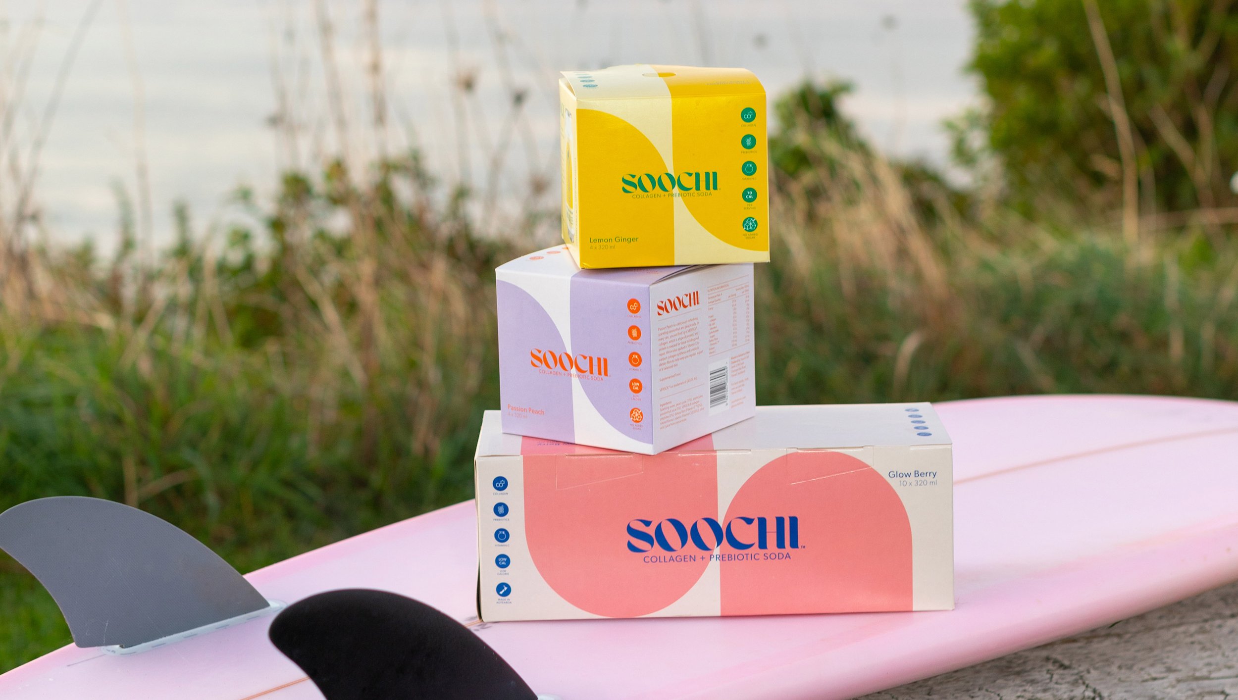
Packaging
BRANDING SCOPE
-
“Contrary to what modern society has been telling us, we’re flipping the script on the one-dimensional standard of beauty. We want you to forget anti-ageing, and think healthy-ageing. We believe in a new attitude of prejuvenation - a cross between rejuvenation and prevention to help you radiate wellness from within.”
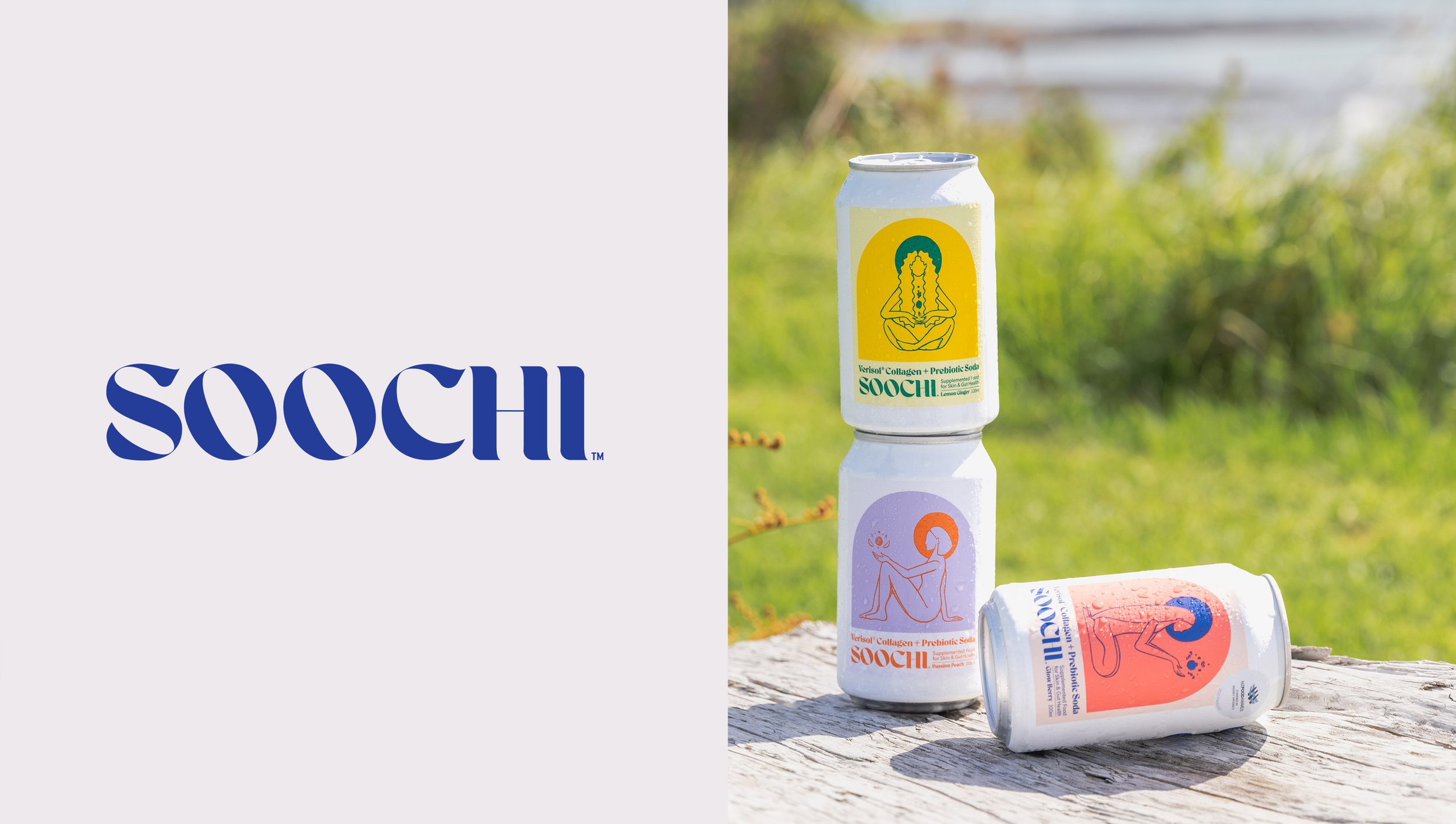
Soochi requested a brand identity and package design that evoked a feeling of calm, with a feminine illustrated aesthetic. It was crucial the packaging design stood out from it’s shelf competitors as a unique product - which sits in the space between food supplement and skincare.
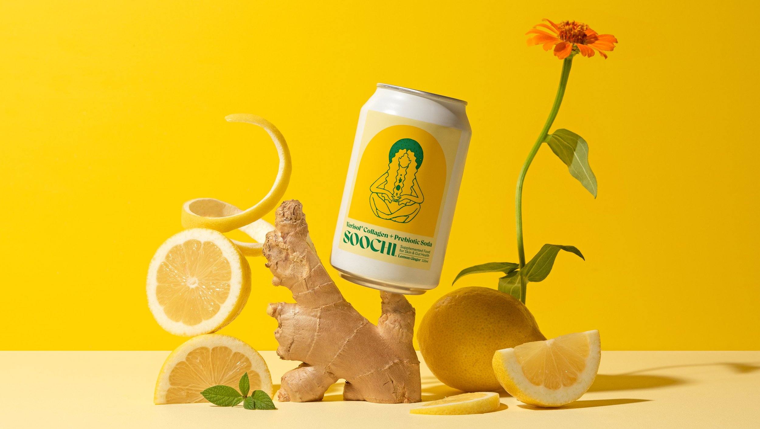
The ‘woman of wellness’ figure illustration was created, housed in warm tones to communicate the drink’s effect and flavours, appealing to the targeted female customer. The serif brand font was chosen for it’s simple elegant modernity customised to a bespoke word mark that compliments the brand and creates a flattering contrast to the linear illustration design.
-
2022:
Good Design Gold Award, Australian Good Design Awards, Australia.
Best Awards Finalist, Packaging. New Zealand Best Awards. -
2023:
Colour Clash; Vibrant colour palettes in graphic design, compiled and published by Counter-print. Counter-Print Books, United Kingdom. -
Photography Credits:
Kindred Studio


